

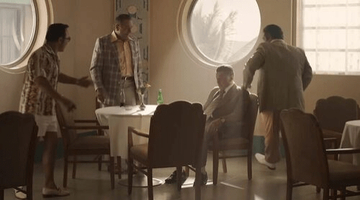
well more like Batman Begins in terms of its color
Oppenheimer - General Information

Amazing poster. Maybe it’s an idea to create a seperate “official posters/artworks” thread?
Posts: 235
Joined:
August 2019
Poster sucks, worse than the Tenet one. But I couldn't care less about posters, one of the most irrelevant things in real world.
Looks like Oppenheimer was the bomb and not the creator of it. Like they are going to drop him on Hiroshima, extract him and then drop him on Nagasaki (sorry if order was reversed)
Actually a great point. Dunkirk's teaser dropped officially online too.
Posts: 139
Joined:
September 2018
an atrocious poster. I thought it's fan art in the beginning.

I mean i like the orange colour.
Posts: 285
Joined:
March 2022
On the one hand I love the billowing smoke and it's colour. On the other hand the lack of detail and the fact that Oppenheimer himself doesn't blend in very well with the smoke makes it not a particularly good poster. I think they could have done better, but I do like the symbolism of Oppenheimer being surrounded by what looks to be the results of his work. It's effective, it just needed more work. Perhaps they should have posted it tomorrow or Saturday, just spent a couple more days to get it right.
oh i assure you the designer got it right at some point, but the client in this case Universal made the designer get it less right, though i dig this one for how out of genere it feels, its way better than the promotional material for Tenet (though the blu ray art was top notch for me) or Interstellar (who had that terribly bland blu ray cover)Waitedalongtime wrote: ↑July 21st, 2022, 11:06 amOn the one hand I love the billowing smoke and it's colour. On the other hand the lack of detail and the fact that Oppenheimer himself doesn't blend in very well with the smoke makes it not a particularly good poster. I think they could have done better, but I do like the symbolism of Oppenheimer being surrounded by what looks to be the results of his work. It's effective, it just needed more work. Perhaps they should have posted it tomorrow or Saturday, just spent a couple more days to get it right.