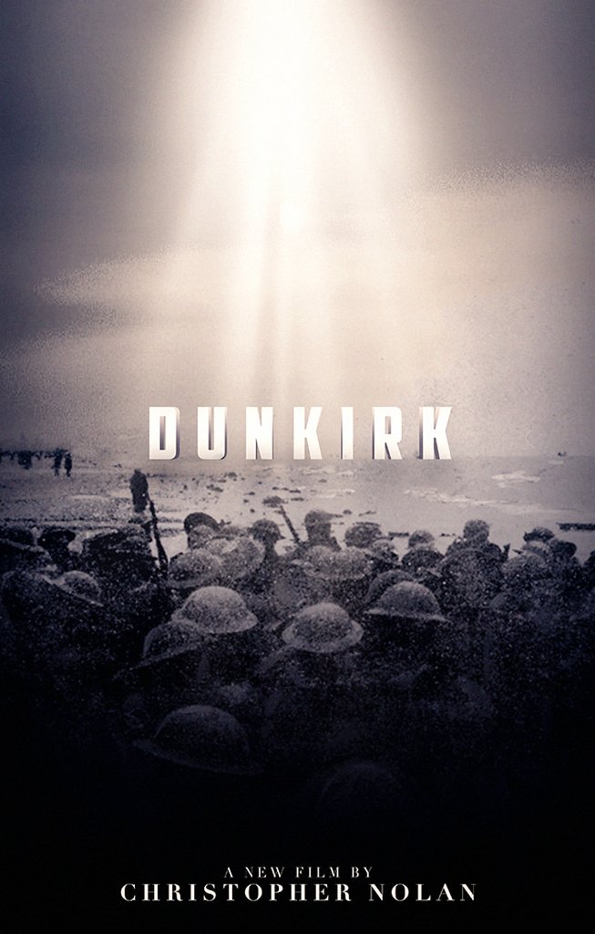
A simple announcement poster.


Well for me it was because half of the reference images that I used were black and white already, so the coloring looked pretty uneven so I decided to just make it monotone and grainy that get that 'old' look. I only spent like 2-3 hours on that poster. Cba to recolor the b/w images.the_red_ninja wrote:I know it's like WW2 and because "aesthetic". But why no color guys?
Great poster, love it. Just one thing, the Arabic name is completely wrong, the letters should not be separated and it should be from right to left. Basically this is how you want it written (دونكيرك).antovolk wrote:Let's kick this off shall we:

Yea. I probably would.GeneMod wrote:So, it's not great. Might work on it a bit more.
DoubleD wrote:Yea. I probably would.GeneMod wrote:So, it's not great. Might work on it a bit more.

MyCocaine wrote:Not mine.