New Banners for the Website (Pictures at the top)

Have any ideas for improvements? Run into any bugs? Let us know here.
User avatar
Posts: 362
Joined: May 2017
Location: Catching this Bullet
So I thought I'd have a play around with the design/CSS of the site and ended up with this... :gonf:

Please excuse the unofficial logo - I didn't have a high resolution copy
Image
Edit: Note that the content actually displays across the entire width
Last edited by ChristMAX on July 28th, 2017, 12:48 am, edited 1 time in total.

User avatar
Posts: 26395
Joined: February 2010
Location: Houston, Texas
Yea the current logo is kind of an early 2000s video game fansite aesthetic.

User avatar
Posts: 19209
Joined: June 2012
Location: stuck in 2020
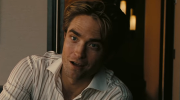
Perhaps it's better to remove those white spots in the NF logo. Oh and replace the pic with one of Nolan holding the IMAX camera during Dunkirk's production. It is time.

User avatar
Posts: 13958
Joined: May 2010
Location: Mumbai
Thirded

User avatar
Posts: 2196
Joined: January 2016
Fourd.

User avatar
Oku
Posts: 3759
Joined: May 2012
Firth.

the clarification in the thread title always brings me joy

User avatar
Posts: 26414
Joined: June 2011
The banner needs to be of Nolan, honestly. And that image isn't high quality enough. And I like the original logo.

User avatar
Posts: 362
Joined: May 2017
Location: Catching this Bullet
Bacon wrote:The banner needs to be of Nolan, honestly. And that image isn't high quality enough. And I like the original logo.
I agree there's nothing wrong with the original logo (besides maybe the texture), I just didn't have access to a high res copy of it until now (thanks ninja). The banner picture is just an example, however it's a 4K still from the teaser trailer, so not sure what you mean by it not being high quality.

Edit: Original post updated with original logo

User avatar
Oku
Posts: 3759
Joined: May 2012
Image

Post Reply