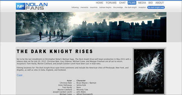
Well, about the layout, I like the actual, but I would go with a dark one. In the film pages, I think it would look better if the titles had the same design as the posters. That's just a suggestion. Some rough examples bellow:
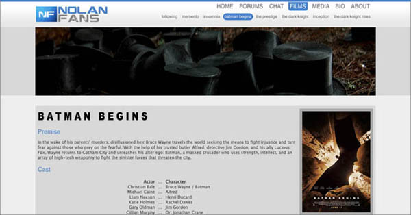
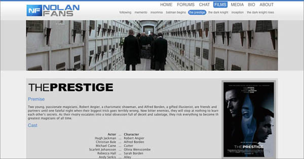
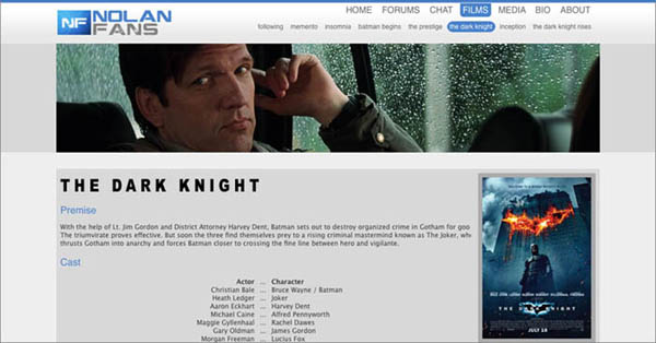
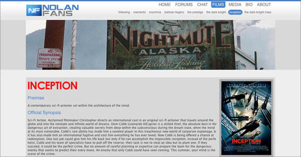


I think it brings the header image (wich I love) and the poster images closer. A graphic element that enriches the page.Mason wrote:Wow. Those film page ideas are awesome.
I completely agree. Alex and Teddy should look at this. It's a tiny change that has a bigger impact.dadosaboya wrote:I think it brings the header image (wich I love) and the poster images closer. A graphic element that enriches the page.Mason wrote:Wow. Those film page ideas are awesome.
I agree with you about the forum pages. but they could have dark edges and in the center, where the messages go, keep the white for better text contrast.Z. Cobb wrote:I enjoy the layout of the forum, no black background + white text... I don't like that... please
Thanks Mason. I'm enjoying Nolan Fans so much, I couldn't resist showing these ideas.Mason wrote:I completely agree. Alex and Teddy should look at this. It's a tiny change that has a bigger impact.dadosaboya wrote:
I think it brings the header image (wich I love) and the poster images closer. A graphic element that enriches the page.